


List flooring, table, built-in storage, trim, and any finishes that will remain. Identify whether their undertones feel warm, cool, red, yellow, or gray. This narrows the wall and textile options before small paint samples or online images create misleading combinations.
Dining Room Color Ideas That Coordinate the Whole Room
Explore dining room color ideas across walls, furniture, textiles, metals, and lighting. Compare olive and oak, blue and brass, layered neutrals, terracotta, charcoal, and fresh green by mood and material balance. Select references that suit the daylight and existing finishes, then generate a coordinated palette direction in PromeAI.
Explore Dining Room Color Ideas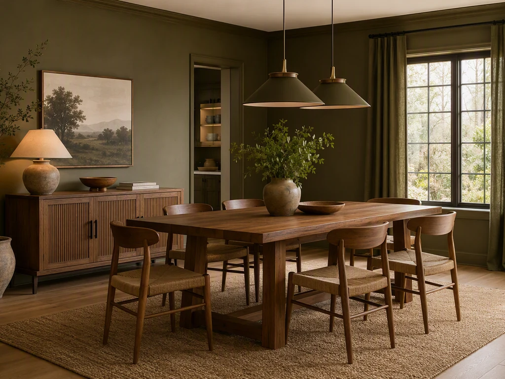
Dining Room Color Ideas by Light and Existing Finishes
Start with fixed elements such as flooring, table wood, trim, and adjoining-room colors. The same wall color changes under warm evening light, cool daylight, or a dark ceiling, so judge palettes as complete material relationships. Compare the six references for undertone, contrast, wood temperature, metal finish, upholstery, daylight, and how the room feels during the meals you use it for most.
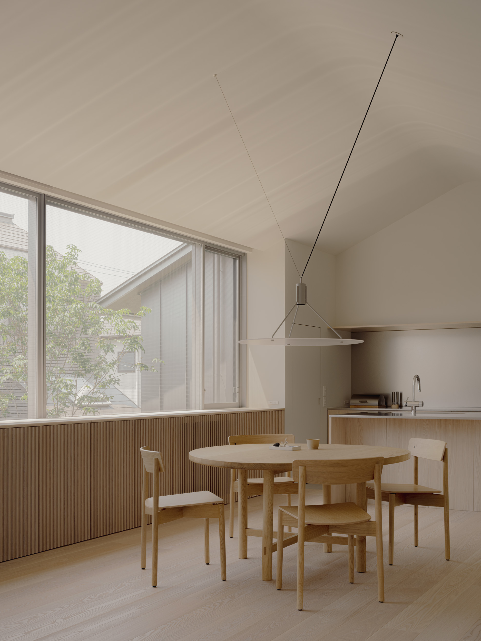
Combine a Base Palette with Controlled Accents
Use one reference to establish the dominant wall and wood relationship, then borrow accents from another through chairs, art, curtains, or table linens. Keep undertones compatible and repeat the accent in more than one place. A coherent palette can include contrast, but every surface should not compete as a separate color statement.
How to Coordinate Dining Room Colors and Finishes
View large samples beside the existing finishes in morning, afternoon, and evening light. Turn on the actual dining fixtures because lamp color can change greens, blues, and neutrals significantly. Test on more than one wall when the room receives uneven daylight.
Choose a dominant base, a supporting material color, and one or two accents. Repeat the accent across separate elements so it looks intentional. Use the highest contrast where you want attention, such as artwork, chairs, or the focal wall, and keep large background surfaces calmer.
Frequently Asked Questions
What color is best for a dining room?
There is no single best color. Choose from the room's daylight, existing wood and flooring, desired mood, and how the space connects to nearby rooms. Warm earthy colors can feel intimate, blues and greens can feel calm, and deep tones can work well when lighting supports them. Always test large samples in place.
Should a dining room be light or dark?
Either can work. Light colors can support limited daylight and an airy mood, while dark colors can create intimacy and make art or lighting stand out. The decision depends on room size, window exposure, evening use, and the contrast of furniture. Good lighting matters more than following a blanket rule.
How do I match dining room wall color with wood furniture?
Identify the wood undertone first. Warm oak often works with olive, cream, muted blue, or terracotta, while cooler or dark woods can support clearer neutrals and controlled contrast. Avoid choosing paint from a small screen image; place samples beside the actual table, flooring, and trim under the room's light.
Can I use more than one color in a dining room?
Yes. Use a dominant base, a supporting color, and a smaller accent rather than dividing every surface equally. Repeat the accent in textiles, art, or chairs to create continuity. Multiple strong wall colors can work, but they need a clear hierarchy and a relationship to the room's fixed finishes.
Can a generated palette predict the exact paint result?
No. Screens, image generation, paint sheen, substrate, daylight, and lamp color all affect the final appearance. Use the generated room to compare relationships and mood, then obtain physical samples and review them beside existing finishes at different times of day before selecting a product or quantity.