


Look for the board's anchor, repeated visual cues, and the decisions it makes easier. A material board may emphasize texture and finish, while an editorial board may prioritize image treatment and type. Evaluate examples by relevance to the project task rather than by surface beauty alone.
Mood Board Examples for Color, Material, and Atmosphere
Explore mood board examples that communicate a visual direction through imagery, color, material, typography, and composition. Compare natural, editorial, cinematic, playful, minimal, and romantic boards by the relationships they establish. Select references whose logic fits your project, then generate a coordinated direction in PromeAI.
Explore Mood Board Examples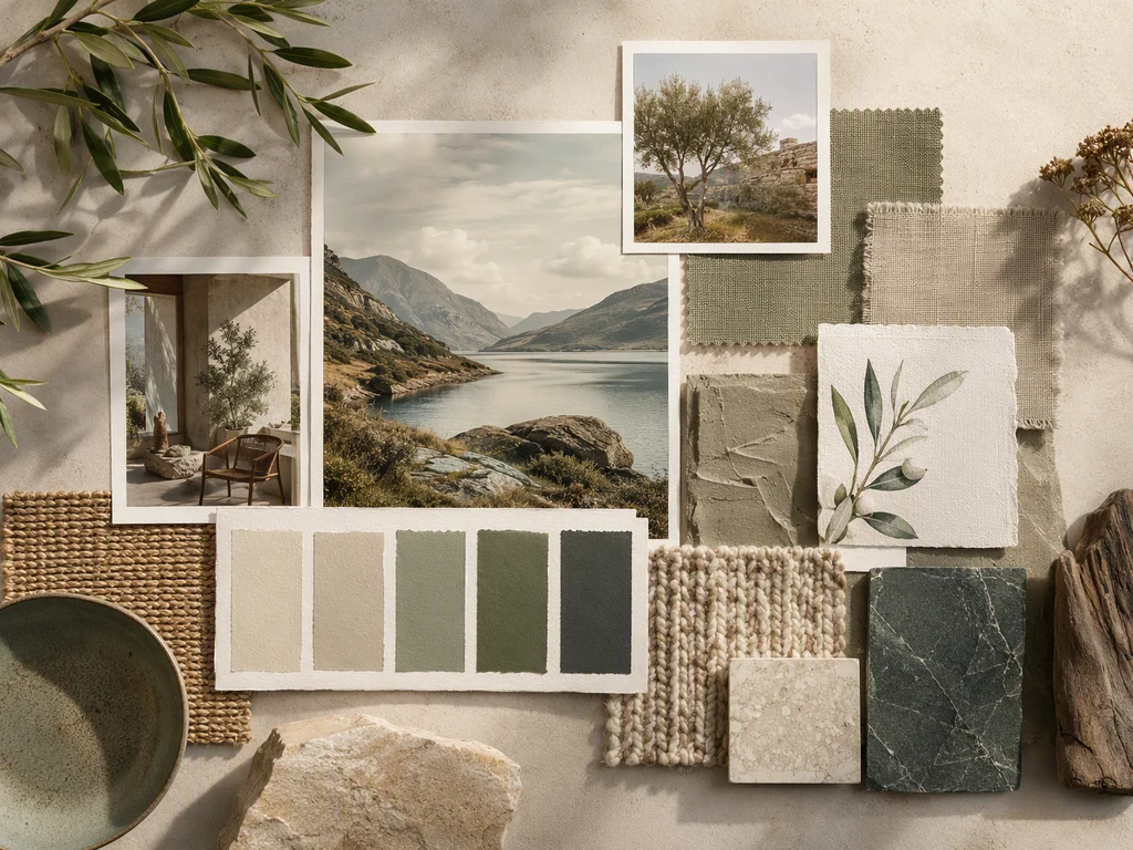
Mood Board Examples by Purpose and Visual Hierarchy
Read each board as a set of decisions rather than a collection of attractive images. Identify the anchor image, repeated colors, material cues, type treatment, and the amount of contrast. Compare the six examples for subject consistency, image scale, negative space, emotional tone, and whether someone unfamiliar with the project could understand the intended direction without a long explanation.
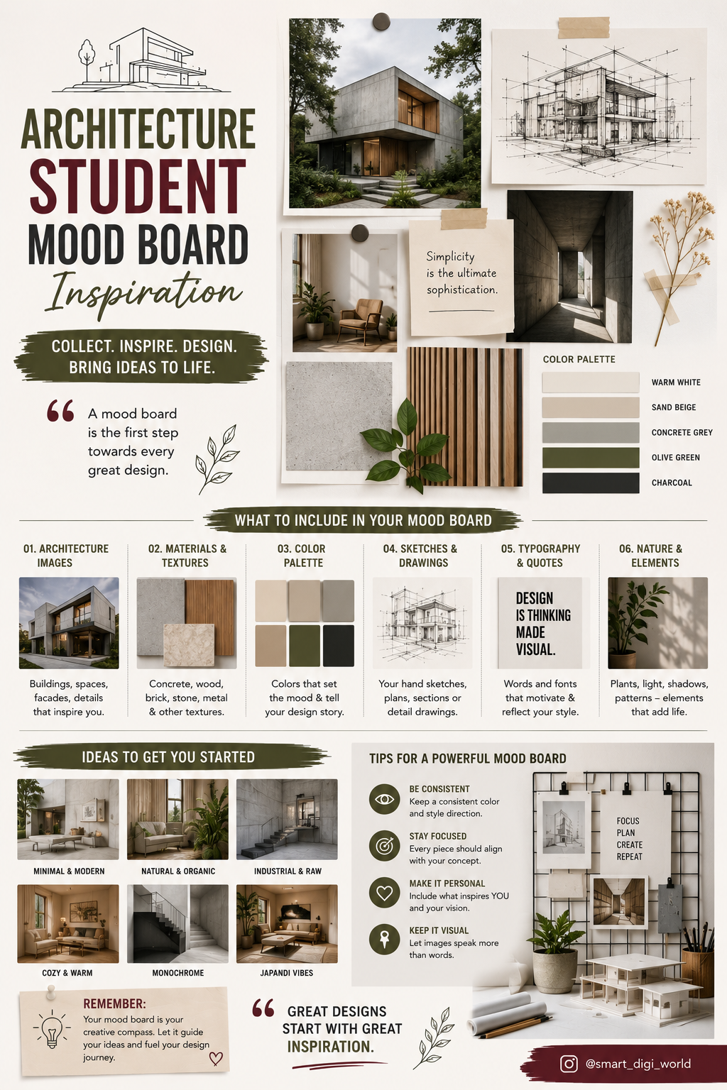
Combine References without Losing the Core Mood
Give each selected board a role: one can guide palette, another material, and another composition. Keep one dominant emotional direction and remove images that introduce a conflicting season, era, or level of formality. A useful combined board narrows choices and supports later decisions; it should not become a catalog of every possibility considered.
How to Read and Use Mood Board Examples
Choose a small palette, a few material or texture cues, and a consistent image language. Write down what is intentionally excluded. This turns inspiration into criteria that can guide later design choices and prevents the board from expanding whenever another appealing image appears.
Use the board to compare an actual color, image, product, or layout choice. If both contradictory options appear equally valid, the direction is too broad. Remove weak references, strengthen the anchor, and check that image rights and source information are managed outside the visual draft.
Frequently Asked Questions
What should a good mood board include?
Include an anchor image, a controlled palette, relevant materials or textures, supporting imagery, and typography only when it affects the direction. Every item should clarify a decision. A good board is selective enough that another person can understand what belongs and what does not.
How many images should be on a mood board?
Use the fewest images needed to communicate the direction clearly. A focused board may work with six to twelve strong references, while a complex project may need more. Remove duplicates and weak images; quantity should not replace hierarchy, source tracking, or a clear relationship between the references.
What is the difference between a mood board and a collage?
A collage can be expressive without guiding a later decision. A mood board has a project purpose: it defines palette, atmosphere, material, image language, or another usable criterion. The two can look similar, but a mood board is judged by whether it creates alignment and helps evaluate what comes next.
Can I combine several mood board examples?
Yes. Use one example for the dominant mood and borrow specific contributions such as palette, material, or layout from others. Remove references that conflict in season, audience, or formality. The combined result should become more specific, not simply contain more styles.
Can I use images from a generated mood board in final work?
Not automatically. The board supports direction finding, but final use depends on the source, license, originality, and project context of each asset. Track references separately, replace unlicensed inspiration when necessary, and verify brand, copyright, privacy, and production requirements before publishing or distributing final work.