


Choose whether the pattern is built from geometry, plants, symbols, lines, or irregular texture. Limit the first direction to a recognizable family and decide which features must remain consistent. Variation becomes easier when the core silhouette, stroke, or construction rule is clear.
Pattern Design That Builds a Clear Visual System
Explore pattern design ideas through motif, rhythm, spacing, scale, and palette. Compare geometric, botanical, abstract, linear, ornamental, and organic directions by how the elements repeat and balance. Select references with compatible visual rules, then generate a coordinated pattern direction in PromeAI for further exploration.
Explore Pattern Design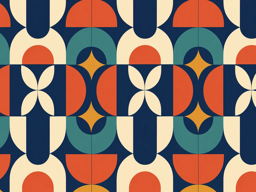
Pattern Design Ideas by Motif and Repeat Rhythm
Start with the relationship between positive shapes and the space around them. A dense botanical pattern, sparse line motif, and rigid geometric grid create different energy even in the same colors. Compare the six references for motif complexity, direction, spacing, scale, contrast, color count, and how easily the visual system could adapt without losing recognition.
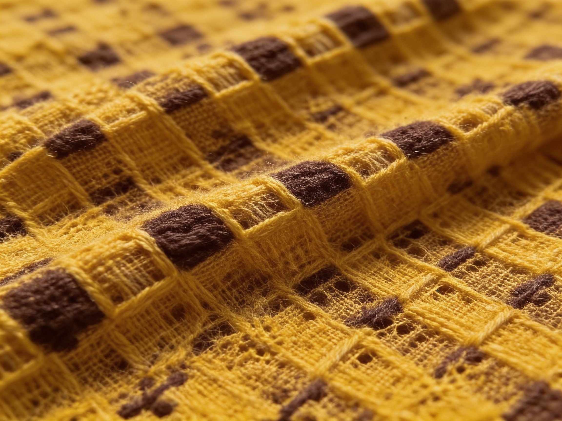
Combine One Motif Language with a Controlled Rhythm
Use one reference to define the motif family and another for palette, spacing, or texture. Avoid combining several unrelated drawing styles or equally dominant motifs. Repeat a small set of shapes with deliberate variation, keep the background active enough to balance them, and judge the direction at more than one viewing scale before continuing it in Canvas.
How to Build a Pattern Direction from Motif, Rhythm, and Scale
Adjust the distance between motifs and the amount of background that remains visible. Test whether the eye reads rows, diagonals, clusters, or an all-over field. Review both a close crop and a larger area, because a motif that works alone may create unintended bands or gaps when repeated.
Assign colors to background, primary motif, secondary motif, and accents rather than distributing them equally. Check value contrast in grayscale and reduce colors when the rhythm becomes difficult to read. Production color limits and exact repeat behavior must be resolved separately from visual exploration.
Frequently Asked Questions
What are the main elements of pattern design?
Motif, repetition, spacing, scale, direction, color, and contrast form the core system. Texture and variation can add character, but they should support a readable rhythm. A strong pattern still works when viewed as a small detail and as a larger field, even though different scales may reveal different qualities.
How do I make a pattern look balanced?
Distribute visual weight, inspect negative space, and check for accidental lines, gaps, or dense clusters. Repeat key shapes while varying secondary details. View a larger tiled area and reduce it to a thumbnail; imbalance that is hard to see in one motif often becomes obvious across the full field.
How many colors should a pattern use?
Use only as many as the visual hierarchy and intended production need. A limited palette can clarify rhythm, while more colors can support depth when roles remain distinct. Start with a background, primary motif, and one accent, then add colors only when they contribute information rather than noise.
Can I combine geometric and organic pattern references?
Yes. Let one define the main structure and the other soften or interrupt it. Keep a shared scale, stroke, palette, or spacing rule so the contrast feels intentional. Equal amounts of unrelated geometry, brushwork, and ornament can weaken the motif hierarchy and make the result difficult to adapt.
Does this page create a production-ready seamless repeat?
No. It supports visual inspiration and direction finding, but the generated result must not be assumed to tile seamlessly or meet manufacturing requirements. Check tile edges, repeat unit, scale, color mode, resolution, trapping, material behavior, and supplier specifications separately before any production use.