


State the poster purpose, audience, viewing context, required action, and one primary message. Separate essential information from optional detail. This determines whether typography, image, symbol, or a date should lead and prevents the design from trying to communicate every fact at equal strength.
Poster Design Ideas That Communicate before They Decorate
Explore poster design ideas that organize message, image, typography, color, and empty space into a clear hierarchy. Compare typographic, image-led, collage, retro, editorial, and abstract directions by viewing distance and purpose. Select references that suit the message, then generate a coordinated visual direction in PromeAI.
Explore Poster Design Ideas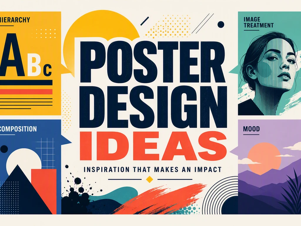
Poster Design Ideas by Message, Audience, and Distance
Define the one thing a viewer must notice first and how far away the poster will be seen. A social graphic, printed event poster, and large display require different text scale and detail. Compare the six references for headline dominance, image role, reading order, contrast, negative space, secondary information, and whether the core message survives at thumbnail size.
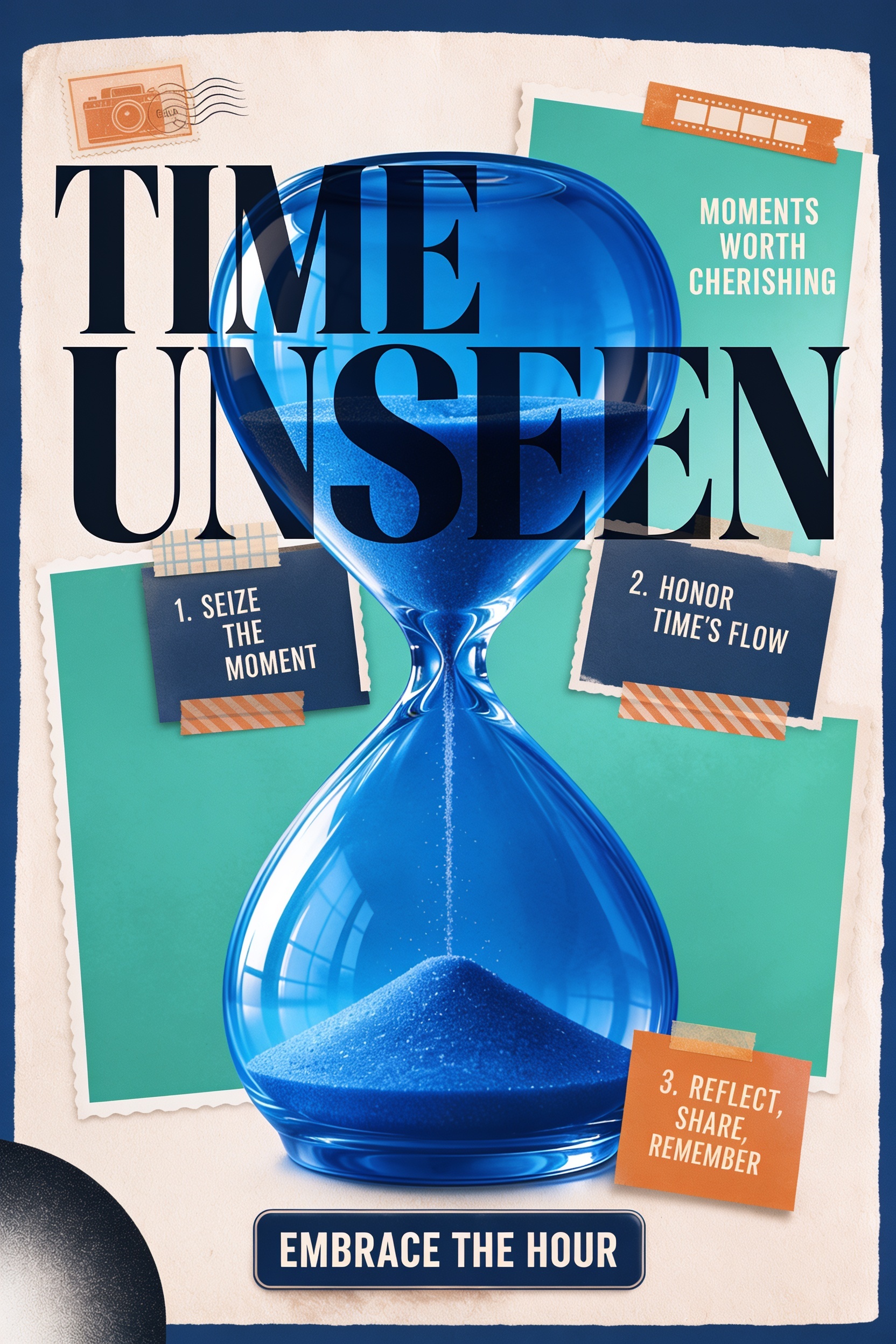
Combine Typography, Image, and Composition with One Priority
Use one reference for hierarchy, another for image treatment, and another for palette or texture. Keep one dominant entry point and reduce elements that compete with the headline or subject. The generated direction can explore composition, but final copy, typography, image rights, output size, color, bleed, and platform requirements must be resolved separately.
How to Turn Poster Design Ideas into a Clear Visual Direction
Create a dominant entry point, a supporting message, and a final detail level. Test the poster as a thumbnail and from the intended distance. Use contrast, scale, alignment, and spacing before adding decorative effects, and keep important text away from busy image areas.
Replace placeholder text, proof every word, and verify image, font, and artwork rights. Adapt dimensions and detail for print, screen, or social crops rather than stretching one composition everywhere. Confirm resolution, color, bleed, margins, accessibility, and supplier or platform specifications.
Frequently Asked Questions
What makes a poster design effective?
An effective poster communicates one primary message quickly, establishes a clear reading order, and remains legible at its viewing distance. Image, type, color, and empty space support that priority. Decorative style matters, but it should not make the headline, subject, date, or required action harder to find.
How many fonts should a poster use?
Use the fewest needed to create hierarchy, often one family with contrasting weights or two compatible typefaces. More fonts can work, but each needs a distinct role. Test small text at final size and avoid using decorative type where essential details require fast reading or accessibility.
How do I make a poster readable from a distance?
Reduce the message, enlarge the primary text, increase contrast, and simplify the image or background behind it. Test the design at a reduced size and from the expected distance. Secondary details can be smaller, but the main subject and action should remain understandable without close inspection.
Can I combine several poster design references?
Yes. Use one reference for hierarchy, another for image treatment, and another for palette or texture. Keep one composition system dominant and avoid combining several display fonts, grids, and visual effects at equal strength. Every selected reference should solve a different part of the same communication brief.
Is the generated poster ready for final publication?
No. Generated text may be inaccurate and the image may not meet rights, size, or production requirements. Rebuild and proof all copy, confirm image and font licensing, and prepare the correct dimensions, resolution, color mode, bleed, margins, accessibility, and printer or platform specifications before publishing.